Introduction
Front-end UIs have increasingly become more complex in the recent past. As a result, several front-end frameworks emerged to improve your development experience. One of these front-end frameworks is refine.
Refine is an open-source, MIT-licensed, React-based framework for building complex data-intensive UIs such as dashboards, admin panels, and internal tools.
A typical Refine project setup created using the project template in the Refine ecosystem comes with a complete suite of tools and configurations. However, it is also highly customizable. Therefore, you can integrate other frameworks like Tremor in your Refine application.
Tremor is a free, open-source, Apache-2.0-licensed React library for building dashboards. It is a relatively new but popular library. You can use it with React and React-based frameworks like Next and refine.
In this article, we will build a simple React admin dashboard using Refine and Tremor.
What we'll cover in this article:
- What is Refine
- How to create a Refine application
- What is Tremor
- How to start using Tremor
- How to build a React admin dashboard with Tremor and Refine
Prerequisites
You need to have the following to try out the examples in this article:
- The Node runtime environment. If you haven't, install it for your operating system from the Node downloads page.
- A text editor like VS Code or Sublime Text. If you haven't, download one for your operating system from the respective downloads page.
What is Refine
As the introduction explains, Refine is a free, open-source, MIT-licensed, React-based framework for building data-intensive front-end applications and UIs such as admin panels, dashboards, and internal tools.
Refine has a rich ecosystem of tools and packages to improve your development experience. A typical Refine project comes with out-of-the-box support for routing, authentication, state management, networking, and internalization.
Refine also integrates some of the popular design systems and UI frameworks like Material UI, Chakra UI, Mantine, and Ant design out of the box. You can opt out and use "headless" Refine if the supported design systems and UI frameworks do not meet your needs.
You can quickly bootstrap a complete Refine application using create refine-app or the refine.new platform. Refine goes out of its way to generate components based on your data source using the Refine Inferencer.
How to create a Refine application
You can create a Refine application using create refine-app or the Refine browser tool platform. Both create refine-app and refine.new platform can bootstrap a new application, complete with all the necessary setup.
Follow the steps below to create a headless Refine application using the Refine browser tool.
Step 1 — Create new Refine application
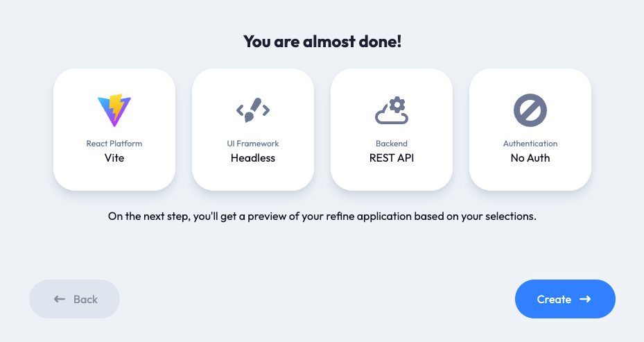
Follow the steps to create a new Refine project. Select Vite as your build tool, Headless as the UI framework, REST API as the back-end service, and no authentication provider.
Step 2 — Log into the refine.new platform
You will automatically navigated to the refine.new landing page and log in using your GitHub or Google account.
After making the above selections, click the "Continue" button. You will be able to preview and test the project on the platform.
Step 3 — Download the project to your local machine
Give the project an appropriate name on the refine.new platform and click the "Build and Download" button to build and download the compressed Gzipped project to your local machine.
If the download doesn't start, navigate to the /projects page and click the "Downloads" button of the particular project you want to download.
Step 4 — Install project dependencies
Extract the contents of the Gzipped project directory you downloaded above to an appropriate location and open it in a text editor of your choice. Use the command below to install the project dependencies.
npm install
Step 5 — Launch the development server
After installing the project dependencies, use one of the commands below to launch the development server on localhost on port 5173.
npm run dev
Your project should look like the image below.
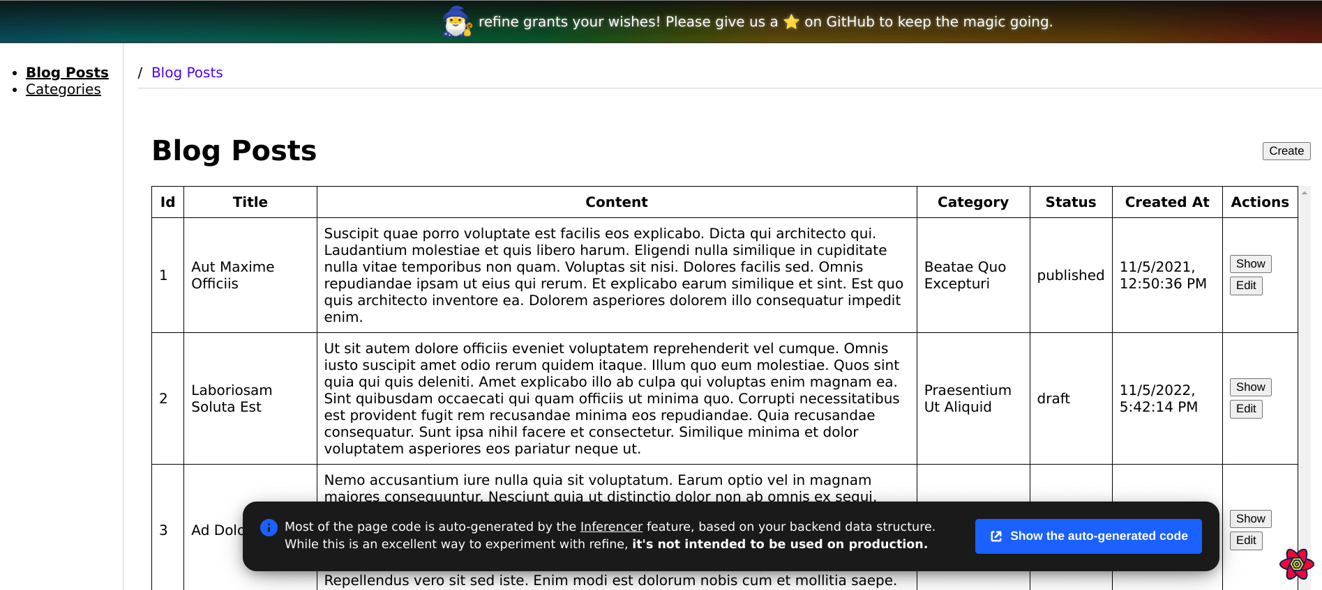
Though we created a “Headless” Refine project, the template we used comes with some basic styling. Some styles will affect our project when we use Tremor and Tailwind CSS later. Let’s remove some of them by applying the changes below to the src/App.css file.
Show App.css code
body {
  margin: 0px;
}


table {
  border-spacing: 0;
  border: 1px solid black;
}

table th,
td {
  margin: 0;
  padding: 0.5rem;
  border-bottom: 1px solid black;
  border-right: 1px solid black;
}

table tr:last-child td {
  border-bottom: 0;
}

table th,
td {
  margin: 0;
  padding: 0.5rem;
  border-bottom: 1px solid black;
  border-right: 1px solid black;
}

table th:last-child,
td:last-child {
  border-right: 0;
} */

.layout {
  display: flex;
  gap: 16px;
}
...
What is Tremor
Like Refine, Tremor is a free, open-source React library for building dashboards. Unlike Refine, Tremor is Apache-2.0-licensed. Though still in beta while writing this article, Tremor is a popular package with over 11K+ GitHub stars.
You can integrate Tremor in a React, Next.js, or Redwood project. In this article, we will integrate it in a Refine project. Tremor uses Tailwind CSS internally. Therefore, any project that intends to use it has to install Tailwind CSS and its peer dependencies.
Tremor has several built-in Components to get you up and running. You have to import and render a Component you want and pass to it the appropriate props.
import { Card, Metric, Text } from "@tremor/react";

const currencyFormatter = Intl.NumberFormat("en-US", {
  style: "currency",
  currency: "USD",
});

export default () => (
  <Card className="mx-auto max-w-xs">
    <Text>Revenue</Text>
    <Metric>{currencyFormatter.format(3_500)}</Metric>
  </Card>
);
Check out the documentation for a complete list of the built-in components and how to use them.
How to start using Tremor
As mentioned above, you install Tremor and its peer dependencies before using it. The installation instructions depend on whether you use React or a React framework like Next.
Do check out the documentation for detailed installation instructions. In this article, we will use Tremor in a Refine project.
If you have created a Refine application as described in one of the previous sub-sections, follow the steps below to install and set up Tremor for your application. We will install Tremor manually in this article. However, you can also use the Tremor CLI. The CLI requires first installing and configuring Tailwind CSS and its dependencies.
Step 1 — Install Tremor
Navigate to your project directory, and use one of the commands below to install Tremor.
npm install @tremor/react
Step 2 — Install Tailwind CSS and its peer dependencies
After successfully installing Tremor in the previous step, use one of the commands below to install Tailwind CSS and its peer dependencies.
npm install -D tailwindcss postcss autoprefixer
In this project, we will also use hero icons. Be sure to also install it like so:
npm install @heroicons/react
Step 3 — Configure Tailwind CSS
Use the command below to generate a tailwind.config.js file at the root of your project directory. It will also create a postcss.config.js file.
npx tailwindcss init -p
You can copy and paste the code below into the tailwind.config.js file. It has the path to the Tremor module and the default theme configuration. You can modify the default theme below to suit your brand. The Tremor Theming documentation explains how to customize the default theme.
Show tailwind.config code
/** @type {import('tailwindcss').Config} */

module.exports = {
  content: [
    "./index.html",
    "./src/**/*.{js,ts,jsx,tsx}",

    // Path to the Tremor module
    "./node_modules/@tremor/**/*.{js,ts,jsx,tsx}",
  ],
  theme: {
    transparent: "transparent",
    current: "currentColor",
    extend: {
      colors: {
        // light mode
        tremor: {
          brand: {
            faint: "#eff6ff", // blue-50
            muted: "#bfdbfe", // blue-200
            subtle: "#60a5fa", // blue-400
            DEFAULT: "#3b82f6", // blue-500
            emphasis: "#1d4ed8", // blue-700
            inverted: "#ffffff", // white
          },
          background: {
            muted: "#f9fafb", // gray-50
            subtle: "#f3f4f6", // gray-100
            DEFAULT: "#ffffff", // white
            emphasis: "#374151", // gray-700
          },
          border: {
            DEFAULT: "#e5e7eb", // gray-200
          },
          ring: {
            DEFAULT: "#e5e7eb", // gray-200
          },
          content: {
            subtle: "#9ca3af", // gray-400
            DEFAULT: "#6b7280", // gray-500
            emphasis: "#374151", // gray-700
            strong: "#111827", // gray-900
            inverted: "#ffffff", // white
          },
        },
        // dark mode
        "dark-tremor": {
          brand: {
            faint: "#0B1229", // custom
            muted: "#172554", // blue-950
            subtle: "#1e40af", // blue-800
            DEFAULT: "#3b82f6", // blue-500
            emphasis: "#60a5fa", // blue-400
            inverted: "#030712", // gray-950
          },
          background: {
            muted: "#131A2B", // custom
            subtle: "#1f2937", // gray-800
            DEFAULT: "#111827", // gray-900
            emphasis: "#d1d5db", // gray-300
          },
          border: {
            DEFAULT: "#1f2937", // gray-800
          },
          ring: {
            DEFAULT: "#1f2937", // gray-800
          },
          content: {
            subtle: "#4b5563", // gray-600
            DEFAULT: "#6b7280", // gray-600
            emphasis: "#e5e7eb", // gray-200
            strong: "#f9fafb", // gray-50
            inverted: "#000000", // black
          },
        },
      },
      boxShadow: {
        // light
        "tremor-input": "0 1px 2px 0 rgb(0 0 0 / 0.05)",
        "tremor-card":
          "0 1px 3px 0 rgb(0 0 0 / 0.1), 0 1px 2px -1px rgb(0 0 0 / 0.1)",
        "tremor-dropdown":
          "0 4px 6px -1px rgb(0 0 0 / 0.1), 0 2px 4px -2px rgb(0 0 0 / 0.1)",
        // dark
        "dark-tremor-input": "0 1px 2px 0 rgb(0 0 0 / 0.05)",
        "dark-tremor-card":
          "0 1px 3px 0 rgb(0 0 0 / 0.1), 0 1px 2px -1px rgb(0 0 0 / 0.1)",
        "dark-tremor-dropdown":
          "0 4px 6px -1px rgb(0 0 0 / 0.1), 0 2px 4px -2px rgb(0 0 0 / 0.1)",
      },
      borderRadius: {
        "tremor-small": "0.375rem",
        "tremor-default": "0.5rem",
        "tremor-full": "9999px",
      },
      fontSize: {
        "tremor-label": ["0.75rem"],
        "tremor-default": ["0.875rem", { lineHeight: "1.25rem" }],
        "tremor-title": ["1.125rem", { lineHeight: "1.75rem" }],
        "tremor-metric": ["1.875rem", { lineHeight: "2.25rem" }],
      },
    },
  },
  safelist: [
    {
      pattern:
        /^(bg-(?:slate|gray|zinc|neutral|stone|red|orange|amber|yellow|lime|green|emerald|teal|cyan|sky|blue|indigo|violet|purple|fuchsia|pink|rose)-(?:50|100|200|300|400|500|600|700|800|900|950))$/,
      variants: ["hover", "ui-selected"],
    },
    {
      pattern:
        /^(text-(?:slate|gray|zinc|neutral|stone|red|orange|amber|yellow|lime|green|emerald|teal|cyan|sky|blue|indigo|violet|purple|fuchsia|pink|rose)-(?:50|100|200|300|400|500|600|700|800|900|950))$/,
      variants: ["hover", "ui-selected"],
    },
    {
      pattern:
        /^(border-(?:slate|gray|zinc|neutral|stone|red|orange|amber|yellow|lime|green|emerald|teal|cyan|sky|blue|indigo|violet|purple|fuchsia|pink|rose)-(?:50|100|200|300|400|500|600|700|800|900|950))$/,
      variants: ["hover", "ui-selected"],
    },
    {
      pattern:
        /^(ring-(?:slate|gray|zinc|neutral|stone|red|orange|amber|yellow|lime|green|emerald|teal|cyan|sky|blue|indigo|violet|purple|fuchsia|pink|rose)-(?:50|100|200|300|400|500|600|700|800|900|950))$/,
    },
    {
      pattern:
        /^(stroke-(?:slate|gray|zinc|neutral|stone|red|orange|amber|yellow|lime|green|emerald|teal|cyan|sky|blue|indigo|violet|purple|fuchsia|pink|rose)-(?:50|100|200|300|400|500|600|700|800|900|950))$/,
    },
    {
      pattern:
        /^(fill-(?:slate|gray|zinc|neutral|stone|red|orange|amber|yellow|lime|green|emerald|teal|cyan|sky|blue|indigo|violet|purple|fuchsia|pink|rose)-(?:50|100|200|300|400|500|600|700|800|900|950))$/,
    },
  ],
  plugins: [require("@headlessui/tailwindcss")],
};
Similarly, create the index.css file in your src directory. You can copy and paste the @tailwind directives below into it.
@tailwind base;
@tailwind components;
@tailwind utilities;
Be sure to import the index.css file you have created above into your src/index.tsx file, like in the example below.
import React from "react";
import { createRoot } from "react-dom/client";

import App from "./App";
import "./i18n";
import "./index.css";

const container = document.getElementById("root") as HTMLElement;
const root = createRoot(container);

root.render(
  <React.StrictMode>
    <React.Suspense fallback="loading">
      <App />
    </React.Suspense>
  </React.StrictMode>,
);
That is everything you need to start using Tremor and Tailwind CSS in your Refine project. You may need to restart the development server.
How to build a React admin dashboard with Tremor and Refine
In this section, we will build a simple React admin dashboard with Tremor and refine. This section assumes you have created a Refine project and installed Tremor, Tailwind CSS, and its peer dependencies. Check out the installation instructions in the previous sub-sections if you haven't.
Launch the Refine project you created in your favorite text editor and follow the steps below to add a basic admin dashboard.
Step 1 — Set up your resources
When we created a Refine project using the refine.new platform, the Refine Inferencer generated components using the data returned from the categories and blog_posts resources of our fake REST API.
In this article, we will add a dashboard to the generated project. We will use the fake restaurant API for our dashboard. Let's add the dashboard resource to the <Refine /> component like in the example below.
Pay attention to the dataProvider and resources prop of the <Refine /> component. We have modified their values.
...
function App() {
  const { t, i18n } = useTranslation();

  const i18nProvider = {
    translate: (key: string, params: object) => t(key, params),
    changeLocale: (lang: string) => i18n.changeLanguage(lang),
    getLocale: () => i18n.language,
  };

  return (
    <BrowserRouter>
      <GitHubBanner />
      <RefineKbarProvider>
        <Refine
          dataProvider={{
            default: dataProvider("https://api.fake-rest.refine.dev"),
            metrics: dataProvider("https://api.finefoods.refine.dev"),
          }}
          i18nProvider={i18nProvider}
          routerProvider={routerBindings}
          resources={[
            ...
            {
              name: "categories",
              list: "/categories",
              create: "/categories/create",
              edit: "/categories/edit/:id",
              show: "/categories/show/:id",
              meta: {
                canDelete: true,
              },
            },
            {
              name: "dashboard",
              list: "/dashboard",
              meta: {
                label: "Dashboard",
                dataProviderName: "metrics",
              },
            },
          ]}
          options={{
            syncWithLocation: true,
            warnWhenUnsavedChanges: true,
          }}
        >
          ...
          <RefineKbar />
          <UnsavedChangesNotifier />
        </Refine>
      </RefineKbarProvider>
    </BrowserRouter>
  );
}

export default App;
After successfully making the above changes, you should see the Dashboard entry in the list of resources on the sidebar on the left.
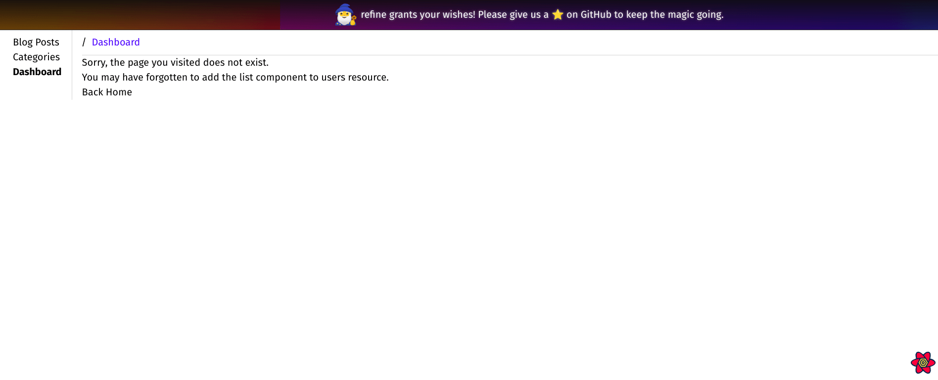
However, clicking the Dashboard link will display an error message like the image above because we have not yet defined a component to render.
Step 2 — Create the Dashboard component
We must declare a component to render whenever a user navigates to the /dashboard route. Create the src/pages/dashboard/index.tsx file. Be aware the dashboard directory doesn't exist yet. You have to create it yourself.
After that, copy and paste the code below into the file you have created above. The DashboardPage component at the moment renders a simple Hello world! We will modify it later.
import React from "react";

export const DashboardPage: React.FC = () => {
  return <p>Hello world!</p>;
};
Import the component you have created above into the src/App.tsx file and render it on the /dashboard route like in the code below.
Show App.tsx code
...
import { DashboardPage } from "./pages/dashboard";

function App() {
  ...

  return (
    <BrowserRouter>
      <GitHubBanner />
      <RefineKbarProvider>
        <Refine
          i18nProvider={i18nProvider}
          routerProvider={routerBindings}
          ...
        >
          <Routes>
            <Route
              element={
                <Layout>
                  <Outlet />
                </Layout>
              }
            >
              ...
              <Route path="/categories">
                <Route index element={<CategoryList />} />
                <Route path="create" element={<CategoryCreate />} />
                <Route path="edit/:id" element={<CategoryEdit />} />
                <Route path="show/:id" element={<CategoryShow />} />
              </Route>
              <Route path="/dashboard">
                <Route index element={<DashboardPage />} />
              </Route>
              <Route path="*" element={<ErrorComponent />} />
            </Route>
          </Routes>

          <RefineKbar />
          <UnsavedChangesNotifier />
        </Refine>
      </RefineKbarProvider>
    </BrowserRouter>
  );
}

export default App;
When you navigate the /dashboard page, you will see Hello world! instead of the error message. Let us now create our dashboard.
Step 3 — Create Overview section of the dashboard
The admin dashboard we want to create consists of the Overview and Details sections. The Overview section summarizes daily revenue, orders, and new customers of a restaurant business.
The daily revenue, orders, and customers constitute the Key Performance Indicators(KPIs) against which we will measure progress toward predetermined annual targets. We will present the data visually in the Overview and Details sections.
Tremor has several dashboard layout templates. We will use one of them in this project. Copy and paste the template below into the src/pages/dashboard/index.tsx file you created in the previous sub-section.
Show Dashboard code
import React from "react";
import {
  Card,
  Grid,
  Title,
  Text,
  Tab,
  TabList,
  TabGroup,
  TabPanel,
  TabPanels,
} from "@tremor/react";

export const DashboardPage: React.FC = () => {
  return (
    <main className="m-2">
      <Title>Dashboard</Title>
      <Text>View core metrics on the state of your company.</Text>
      <TabGroup className="mt-6">
        <TabList>
          <Tab>Overview</Tab>
          <Tab>Details</Tab>
        </TabList>
        <TabPanels>
          <TabPanel>
            <Grid numItemsMd={2} numItemsLg={3} className="mt-6 gap-6">
              <Card>
                <div className="h-28" />
              </Card>
              <Card>
                <div className="h-28" />
              </Card>
              <Card>
                <div className="h-28" />
              </Card>
            </Grid>
            <div className="mt-6">
              <Card>
                <div className="h-80" />
              </Card>
            </div>
          </TabPanel>
          <TabPanel>
            <div className="mt-6">
              <Card>
                <div className="h-96" />
              </Card>
            </div>
          </TabPanel>
        </TabPanels>
      </TabGroup>
    </main>
  );
};
The Overview section should now look like the image below. The Overview template has a three-column KPI section and another section below it to graphically represent variations over time.
You can switch between the Overview and Details sections using the tab.
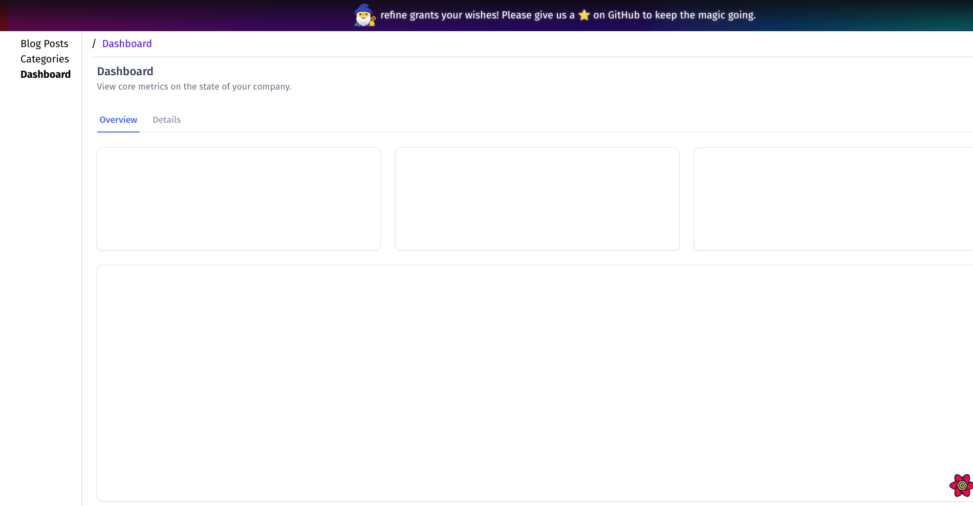
Now that we have the layout of our project, let's retrieve the data to display from the fake API. Modify the DashboardPage component in the src/pages/dashboard/index.tsx file to include the code below.
Show Dashboard code
import React from "react";
import {
  Card,
  Grid,
  Title,
  Text,
  Tab,
  TabList,
  TabGroup,
  TabPanel,
  TabPanels,
} from "@tremor/react";

import { useApiUrl, useCustom } from "@refinedev/core";
import dayjs from "dayjs";

const query = {
  start: dayjs().subtract(7, "days").startOf("day"),
  end: dayjs().startOf("day"),
};

export const DashboardPage: React.FC = () => {
  const API_URL = useApiUrl("metrics");

  const { data: dailyRevenue } = useCustom({
    url: `${API_URL}/dailyRevenue`,
    method: "get",
    config: {
      query,
    },
  });

  const { data: dailyOrders } = useCustom({
    url: `${API_URL}/dailyOrders`,
    method: "get",
    config: {
      query,
    },
  });

  const { data: newCustomers } = useCustom({
    url: `${API_URL}/newCustomers`,
    method: "get",
    config: {
      query,
    },
  });

  return <main className="m-2">...</main>;
};
In the code above, we used the useCustom hook to retrieve the data from our fake restaurant API using the GET method. The sets of data we need are from different endpoints.
You can log the data above to the browser console to see what it looks like. We will now create one component for the three KPIs and reuse it for all three. Create the src/pages/dashboard/kpiCard/index.tsx file, and copy and paste the code below.
import {
  Card,
  Text,
  Metric,
  Flex,
  ProgressBar,
  BadgeDelta,
  DeltaType,
} from "@tremor/react";

const getDeltaType = (trend: number): DeltaType => {
  if (trend < -35) return "decrease";
  if (trend < 0) return "moderateDecrease";
  if (trend === 0) return "unchanged";
  if (trend < 30) return "moderateIncrease";
  return "increase";
};

export const KpiCard = ({
  title,
  total,
  trend,
  target,
  percentage,
}: {
  title: string;
  total: string;
  trend: number;
  target: string;
  percentage: number;
}) => {
  return (
    <Card className="max-w-lg">
      <Flex alignItems="start">
        <div>
          <Text>{title}</Text>
          <Metric>{total}</Metric>
        </div>
        <BadgeDelta deltaType={getDeltaType(trend)}>{`${trend}%`}</BadgeDelta>
      </Flex>
      <Flex className="mt-4">
        <Text className="truncate">{`${percentage}% (${total})`}</Text>
        <Text>{`Target(${target})`}</Text>
      </Flex>
      <ProgressBar value={percentage} className="mt-2" />
    </Card>
  );
};
The component above will look like the image below after rendering.

The above component is for the key performance indicators in our restaurant business. As highlighted in the data we fetched in the previous sub-section, we are tracking three KPIs.
We will reuse the same component for all three KPIs. Import and render the above component by applying the following changes to the src/pages/dashboard/index.tsx file.
Show Dashboard code
import React from "react";
import {
  Card,
  Grid,
  Title,
  Text,
  Tab,
  TabList,
  TabGroup,
  TabPanel,
  TabPanels,
} from "@tremor/react";

import { useApiUrl, useCustom } from "@refinedev/core";
import dayjs from "dayjs";

const query = {
  start: dayjs().subtract(7, "days").startOf("day"),
  end: dayjs().startOf("day"),
};

import { KpiCard } from "./kpiCard";

const calculatePercentage = (total: number, target: number): number => {
  return Math.round((total / target) * 100 * 100) / 100;
};

export const DashboardPage: React.FC = () => {
  const API_URL = useApiUrl("metrics");

  const { data: dailyRevenue } = useCustom({
    url: `${API_URL}/dailyRevenue`,
    method: "get",
    config: {
      query,
    },
  });

  const { data: dailyOrders } = useCustom({
    url: `${API_URL}/dailyOrders`,
    method: "get",
    config: {
      query,
    },
  });

  const { data: newCustomers } = useCustom({
    url: `${API_URL}/newCustomers`,
    method: "get",
    config: {
      query,
    },
  });

  return (
    <main className="m-2">
      <Title>Dashboard</Title>
      <Text>View core metrics on the state of your company.</Text>
      <TabGroup className="mt-6">
        <TabList>
          <Tab>Overview</Tab>
          <Tab>Details</Tab>
        </TabList>
        <TabPanels>
          <TabPanel>
            <Grid numItemsMd={2} numItemsLg={3} className="mt-6 gap-6">
              <KpiCard
                title="Weekly Revenue"
                total={`$ ${dailyRevenue?.data.total ?? 0}`}
                trend={dailyRevenue?.data.trend ?? 0}
                target="$ 10,500"
                percentage={calculatePercentage(
                  dailyRevenue?.data.total ?? 0,
                  10_500,
                )}
              />
              <KpiCard
                title="Weekly Orders"
                total={`${dailyOrders?.data.total ?? 0}`}
                trend={dailyOrders?.data.trend ?? 0}
                target="500"
                percentage={calculatePercentage(
                  dailyOrders?.data.total ?? 0,
                  500,
                )}
              />
              <KpiCard
                title="New Customers"
                total={`${newCustomers?.data.total ?? 0}`}
                trend={newCustomers?.data.trend ?? 0}
                target="200"
                percentage={calculatePercentage(
                  newCustomers?.data.total ?? 0,
                  200,
                )}
              />
            </Grid>
            <div className="mt-6">
              <Card>
                <div className="h-80" />
              </Card>
            </div>
          </TabPanel>
          <TabPanel>
            <div className="mt-6">
              <Card>
                <div className="h-96" />
              </Card>
            </div>
          </TabPanel>
        </TabPanels>
      </TabGroup>
    </main>
  );
};
After applying the above changes, your Dashboard section should look like the image below.
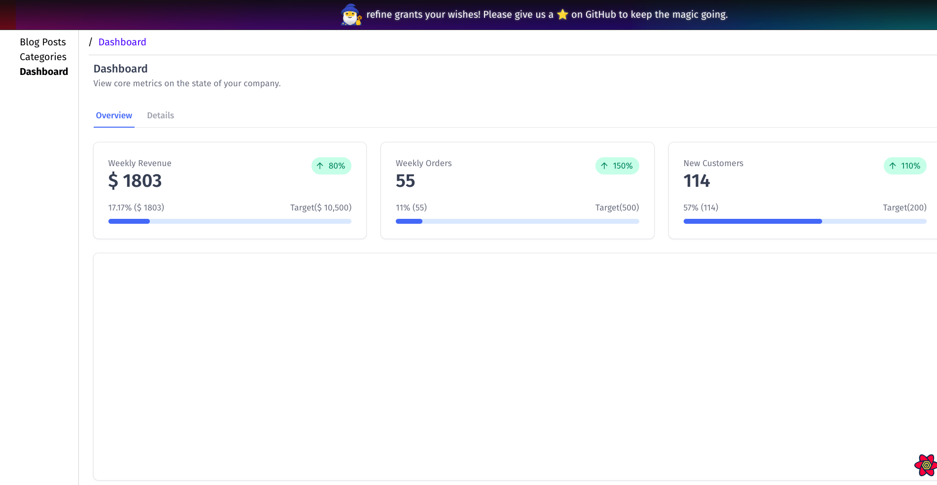
Similarly, let us create a component to visualize the daily variation of our KPIs over time. We will display it below the KPIs. Create the src/pages/dashboard/chartView/index.tsx file. You can copy and paste the code below into it.
Show dashboard/chartView code
import { useState } from "react";
import {
  AreaChart,
  Card,
  Flex,
  Text,
  Title,
  Icon,
  TabGroup,
  TabList,
  Tab,
} from "@tremor/react";

import { InformationCircleIcon } from "@heroicons/react/24/solid";

interface IObject {
  date: string;
  value: string;
}

interface IProps {
  revenue: IObject[];
  orders: IObject[];
  customers: IObject[];
}

// Basic formatters for the chart values
const dollarFormatter = (value: number) =>
  `$ ${Intl.NumberFormat("us").format(value).toString()}`;

const numberFormatter = (value: number) =>
  `${Intl.NumberFormat("us").format(value).toString()}`;

const formatDate = new Intl.DateTimeFormat("en-US", {
  month: "short",
  year: "numeric",
  day: "numeric",
});

export function ChartView({ revenue, orders, customers }: IProps) {
  const [selectedKpi, setSelectedKpi] = useState(0);

  // map formatters by selectedKpi
  const formatters: { [key: string]: any } = {
    revenue: dollarFormatter,
    orders: numberFormatter,
    customers: numberFormatter,
  };

  let data = revenue;
  if (selectedKpi === 1) {
    data = orders;
  }

  if (selectedKpi === 2) {
    data = customers;
  }

  const transformedData = data.map((dataObj) => {
    const date = new Date(dataObj.date);
    dataObj.date = formatDate.format(date);

    return dataObj;
  });

  return (
    <Card>
      <div className="justify-between md:flex">
        <div>
          <Flex
            justifyContent="start"
            className="space-x-0.5"
            alignItems="center"
          >
            <Title> Performance History </Title>
            <Icon
              icon={InformationCircleIcon}
              variant="simple"
              tooltip="Shows daily performance change"
            />
          </Flex>
          <Text> Daily increase or decrease per domain </Text>
        </div>
        <div className="mt-6 md:mt-0">
          <TabGroup
            index={selectedKpi}
            onIndexChange={(idx) => setSelectedKpi(idx)}
          >
            <TabList>
              <Tab>Revenue</Tab>
              <Tab>Orders</Tab>
              <Tab>Customers</Tab>
            </TabList>
          </TabGroup>
        </div>
      </div>
      <AreaChart
        data={transformedData}
        index="date"
        categories={["value"]}
        colors={["blue"]}
        showLegend={true}
        valueFormatter={formatters[selectedKpi]}
        yAxisWidth={56}
        className="mt-8 h-96"
      />
    </Card>
  );
}
The component above will look like the image below after rendering.

Let us import the component above and render it in the DashboardPage component. Add the following changes to the src/pages/dashboard/index.tsx file. We are replacing the last placeholder component in the Overview section of our template.
import React from "react";
import {
  Card,
  Grid,
  Title,
  Text,
  Tab,
  TabList,
  TabGroup,
  TabPanel,
  TabPanels,
} from "@tremor/react";

import { useApiUrl, useCustom } from "@refinedev/core";
import dayjs from "dayjs";

const query = {
  start: dayjs().subtract(7, "days").startOf("day"),
  end: dayjs().startOf("day"),
};

import { KpiCard } from "./kpiCard";
import { ChartView } from "./chartView";

const calculatePercentage = (total: number, target: number): number => {
  return Math.round((total / target) * 100 * 100) / 100;
};

export const DashboardPage: React.FC = () => {
  ...

  return (
    <main className="m-2">
      <Title>Dashboard</Title>
      <Text>View core metrics on the state of your company.</Text>
      <TabGroup className="mt-6">
        <TabList>
          <Tab>Overview</Tab>
          <Tab>Details</Tab>
        </TabList>
        <TabPanels>
          <TabPanel>
            <Grid numItemsMd={2} numItemsLg={3} className="gap-6 mt-6">
              ...
            </Grid>
            <div className="mt-6">
              <ChartView
                revenue={dailyRevenue?.data.data ?? []}
                orders={dailyOrders?.data.data ?? []}
                customers={newCustomers?.data.data ?? []}
              />
            </div>
          </TabPanel>
          <TabPanel>
            <div className="mt-6">
              <Card>
                <div className="h-96" />
              </Card>
            </div>
          </TabPanel>
        </TabPanels>
      </TabGroup>
    </main>
  );
};
Your dashboard Overview section should now look like the image below.
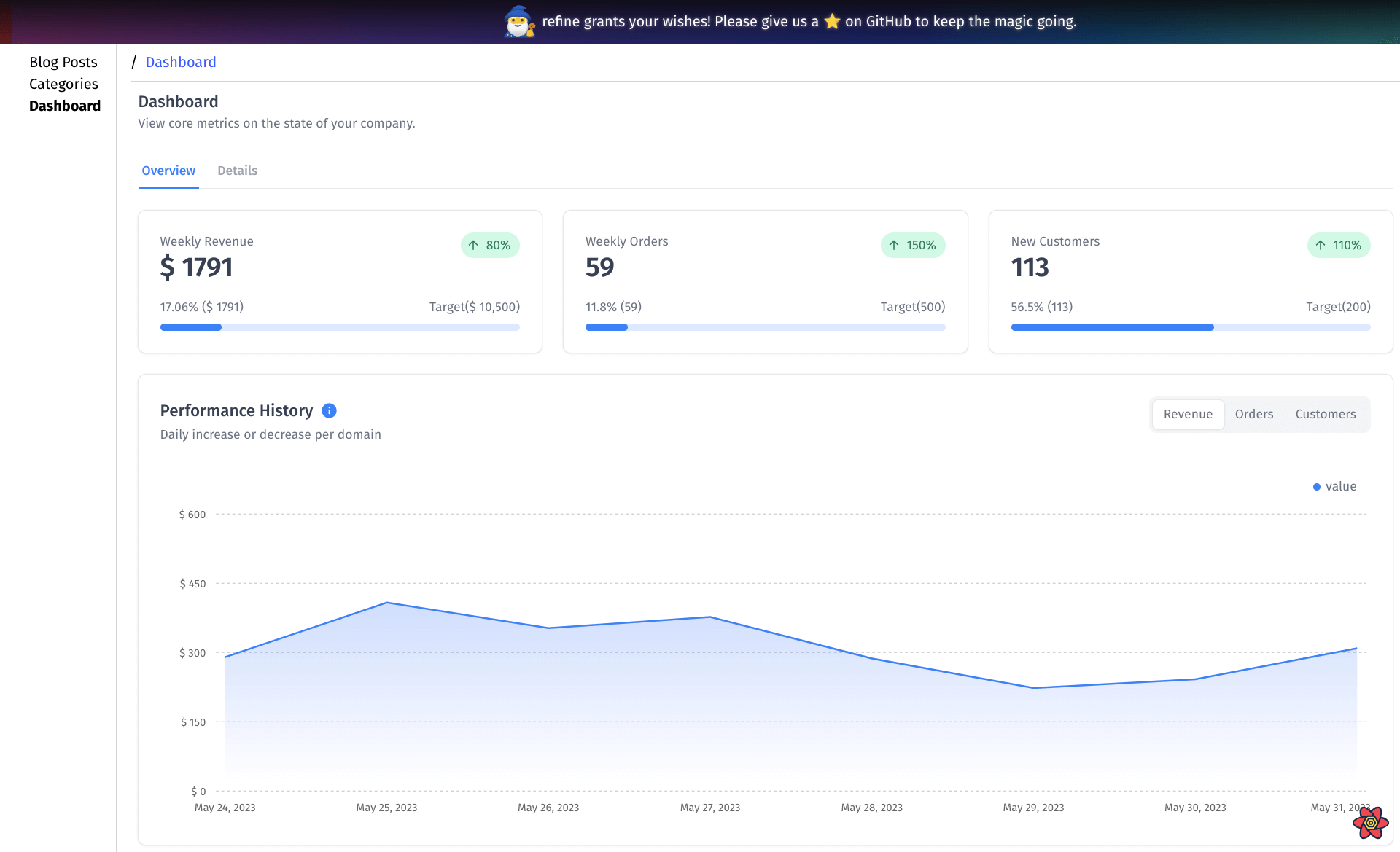
Step 4 — Create Details section of the dashboard
We have finished creating the Overview section. Let's create the Details section of the dashboard. When you click the Details button, Refine renders a blank placeholder component which, at the moment, looks like the image below.
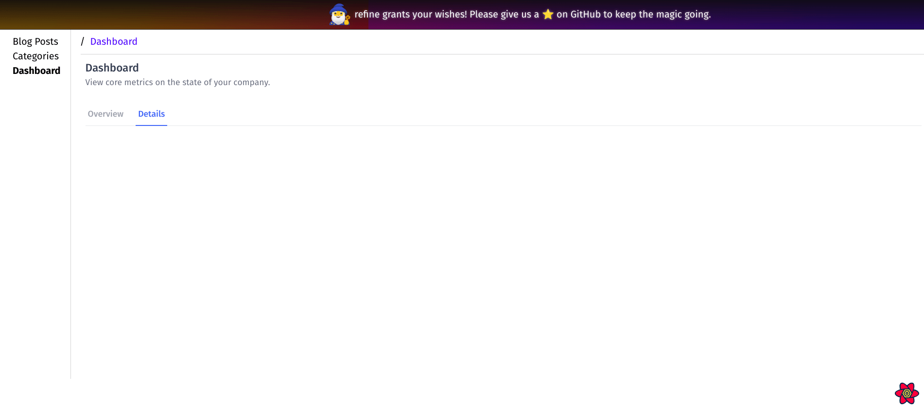
We will create a separate component for our Details section. Create the src/pages/dashboard/details/index.tsx file. Copy and paste the code below into it.
Show Dashboard Details code
import React from "react";
import { useTable } from "@refinedev/react-table";
import { ColumnDef, flexRender } from "@tanstack/react-table";

import {
  Card,
  Table,
  TableHead,
  TableRow,
  TableHeaderCell,
  TableBody,
  TableCell,
  Text,
  Title,
  Button,
  Flex,
  TextInput,
  Icon,
  DeltaType,
  BadgeDelta,
  Select,
  SelectItem,
} from "@tremor/react";
import {
  ChevronLeftIcon,
  ChevronRightIcon,
  ChevronDoubleLeftIcon,
  ChevronDoubleRightIcon,
  InformationCircleIcon,
} from "@heroicons/react/24/solid";

const formatCurrency = Intl.NumberFormat("en-US", {
  style: "currency",
  currency: "USD",
});

const formatDate = Intl.DateTimeFormat("en-US", {
  dateStyle: "medium",
  timeStyle: "medium",
});

const getDeltaType = (status: number): DeltaType => {
  // Order is Pending or Ready
  if (status === 1 || status === 2) return "unchanged";
  // Order is on its way
  if (status === 3) return "moderateIncrease";
  // Order has been delivered
  if (status === 4) return "increase";
  // Order has been cancelled
  if (status === 5) return "decrease";
  // Status is unknown
  return "decrease";
};

export const Details = () => {
  const columns = React.useMemo<ColumnDef<any>[]>(
    () => [
      {
        id: "id",
        accessorKey: "id",
        header: "No.",
        enableColumnFilter: false,
      },
      {
        id: "amount",
        accessorKey: "amount",
        cell: ({ getValue }) => formatCurrency.format(+getValue<any>()),
        header: "Amount",
        enableColumnFilter: false,
      },
      {
        id: "fullName",
        accessorKey: "fullName",
        header: "Ordered By",
        meta: {
          filterOperator: "contains",
        },
      },

      {
        id: "gender",
        accessorKey: "gender",
        header: "Gender",
        enableColumnFilter: false,
      },
      {
        id: "gsm",
        accessorKey: "gsm",
        header: "Tel",
        enableColumnFilter: false,
      },
      {
        id: "address",
        accessorKey: "address",
        header: "Delivery Address",
        meta: {
          filterOperator: "contains",
        },
      },
      {
        id: "status",
        accessorKey: "status",
        cell: function render({ row, getValue }) {
          const deltaType = getDeltaType(row?.original?.statusId ?? 0);
          return (
            <BadgeDelta deltaType={deltaType}>{getValue<any>()}</BadgeDelta>
          );
        },
        header: "Delivery Status",
        enableColumnFilter: false,
      },
      {
        id: "createdAt",
        accessorKey: "createdAt",
        header: "Created At",
        cell: function render({ getValue }) {
          return formatDate.format(new Date(getValue<any>()));
        },
        enableColumnFilter: false,
      },
    ],
    [],
  );

  const {
    getHeaderGroups,
    getRowModel,
    refineCore: {
      tableQuery: { data: tableData },
    },
    getState,
    setPageIndex,
    getCanPreviousPage,
    getPageCount,
    getCanNextPage,
    nextPage,
    previousPage,
    setPageSize,
  } = useTable({
    columns,
    refineCoreProps: {
      dataProviderName: "metrics",
      resource: "orders",
      filters: {
        mode: "off",
      },
      queryOptions: {
        select(data) {
          const retrievedData = data.data;
          const transformedData = [];
          for (const dataObj of retrievedData) {
            const {
              id,
              amount,
              orderNumber,
              createdAt,
              user: { fullName, gender, gsm },
              address,
              status,
            } = dataObj;

            transformedData.push({
              id,
              amount: `${amount}`,
              orderNumber,
              createdAt,
              fullName,
              gender,
              gsm,
              address: address?.text,
              status: status?.text,
              statusId: status?.id,
            });
          }

          return { data: transformedData, total: data.total };
        },
      },
    },
  });

  return (
    <Card>
      <Flex justifyContent="start" className="space-x-0.5" alignItems="center">
        <Title>Customer Orders</Title>
        <Icon
          icon={InformationCircleIcon}
          variant="simple"
          tooltip="Shows customer orders"
        />
      </Flex>

      <Table>
        <TableHead>
          {getHeaderGroups().map((headerGroup) => (
            <TableRow key={headerGroup.id}>
              {headerGroup.headers.map((header) => (
                <TableHeaderCell key={header.id}>
                  {!header.isPlaceholder && (
                    <>
                      {flexRender(
                        header.column.columnDef.header,
                        header.getContext(),
                      )}
                      {header.column.getCanFilter() ? (
                        <TextInput
                          value={
                            (header.column.getFilterValue() as string) ?? ""
                          }
                          placeholder={`Enter ${header.column.id}`}
                          onChange={(e) => {
                            const { value } = e.target;
                            header.column.setFilterValue(value);
                          }}
                        />
                      ) : null}
                    </>
                  )}
                </TableHeaderCell>
              ))}
            </TableRow>
          ))}
        </TableHead>
        <TableBody>
          {getRowModel().rows.map((row) => (
            <TableRow key={row.id}>
              {row.getVisibleCells().map((cell) => (
                <TableCell key={cell.id}>
                  {flexRender(cell.column.columnDef.cell, cell.getContext())}
                </TableCell>
              ))}
            </TableRow>
          ))}
        </TableBody>
      </Table>
      <Flex
        className="mt-2  flex-wrap gap-2"
        justifyContent="between"
        alignItems="center"
      >
        <Flex className="w-4/8 flex-wrap gap-2">
          <Button
            size="xs"
            icon={ChevronDoubleLeftIcon}
            iconPosition="left"
            onClick={() => setPageIndex(0)}
            disabled={!getCanPreviousPage()}
          >
            First Page
          </Button>
          <Button
            size="xs"
            icon={ChevronLeftIcon}
            iconPosition="left"
            onClick={() => previousPage()}
            disabled={!getCanPreviousPage()}
          >
            Previous Page
          </Button>
          <Button
            size="xs"
            icon={ChevronRightIcon}
            iconPosition="right"
            onClick={() => nextPage()}
            disabled={!getCanNextPage()}
          >
            Next Page
          </Button>
          <Button
            size="xs"
            icon={ChevronDoubleRightIcon}
            iconPosition="right"
            onClick={() => setPageIndex(getPageCount() - 1)}
            disabled={!getCanNextPage()}
          >
            Last Page
          </Button>
        </Flex>
        <Text className="w-1/8">
          Page {getState().pagination.pageIndex + 1} of {getPageCount()}{" "}
        </Text>
        <TextInput
          type="text"
          placeholder="Enter Page"
          className="w-1/8 max-w-xs"
          defaultValue={`${getState().pagination.pageIndex + 1}`}
          onChange={(e) => {
            const { value } = e.target;
            if (isNaN(Number(value))) {
              return;
            }
            const page = value ? Number(value) - 1 : 0;
            setPageIndex(page);
          }}
        />

        <Select
          className="w-2/8"
          onValueChange={(value) => setPageSize(Number(value))}
        >
          {[10, 20, 30, 40, 50].map((pageSize) => (
            <SelectItem key={pageSize} value={`${pageSize}`}>
              {pageSize}
            </SelectItem>
          ))}
        </Select>
      </Flex>
    </Card>
  );
};
Import the above component and render it in the DashboardPage component. Add the changes below to the src/pages/dashboard/index.tsx file.
...

import { KpiCard } from "./kpiCard";
import { ChartView } from "./chartView";
import { Details } from "./details";

...

export const DashboardPage: React.FC = () => {
  ...

  return (
    <main className="m-2">
      <Title>Dashboard</Title>
      <Text>View core metrics on the state of your company.</Text>
      <TabGroup className="mt-6">
        <TabList>
          <Tab>Overview</Tab>
          <Tab>Details</Tab>
        </TabList>
        <TabPanels>
          <TabPanel>
           ...
          </TabPanel>
          <TabPanel>
            <div className="mt-6">
              <Details />
            </div>
          </TabPanel>
        </TabPanels>
      </TabGroup>
    </main>
  );
};
The Details section of your dashboard should now look like the image below.
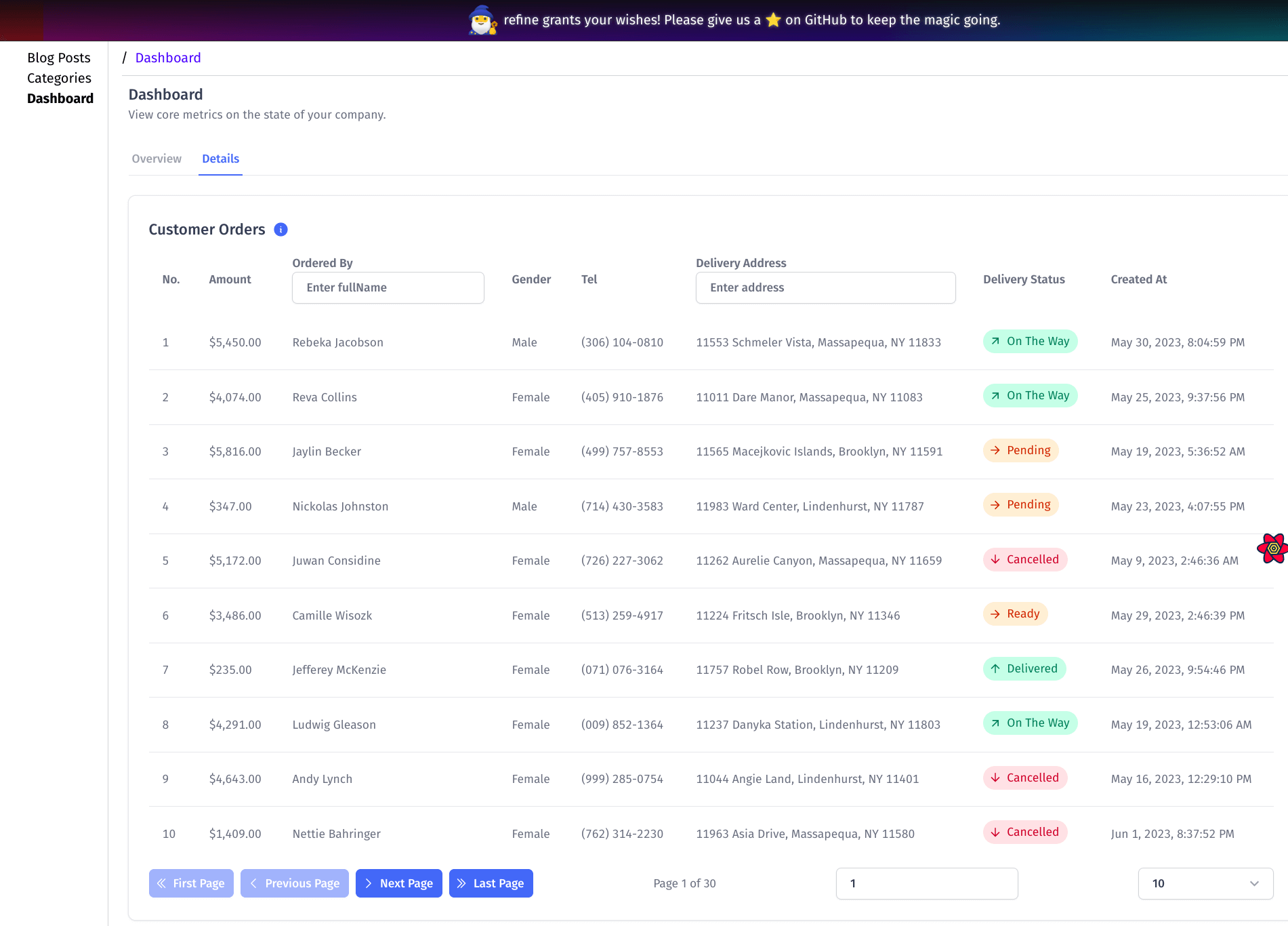
You have just built a simple dashboard using Refine and Tremor. To explore more on what you can do with Refine or Tremor, check out the Refine or Tremor documentation.
Conclusion
Using front-end frameworks, such as Refine or Tremor, is inevitable when building complex data-intensive and interactive front-end applications such as admin panels.
They significantly reduce development time and improve your development experience. With tools such as create refine-app and refine.new platform in the Refine ecosystem, you can create a production-ready application within minutes.
A production-ready Refine application comes with an out-of-the-box setup for state management, route management, internationalization, authentication, and integration for the most popular cloud platforms like Firebase and Supabase.
On the other hand, Tremor is a new but promising React framework for building dashboards. You can use it with most React frameworks like Next, Redwood, and refine.
As highlighted above, when you integrate Refine with Tremor, you can build complex applications fast. Both frameworks are free and open source with permissible licenses.
Live CodeSandbox Example
npm create refine-app@latest -- --example blog-refine-tremor

